Welcome to Part 3 of the Regpack Blog’s Communication Series!
We think Communication is super important, both internally and with your clients. We’re presenting a 3 part series looking at all aspects of communication.
Part 1 addressed what is communication and how we communicate in business. Part 2 went into various forms of ineffective communication we have seen throughout years of experience.
And Part 3 below concludes with how an online registration process can improve and revolutionize your communication internally and with your clients!
We hope you enjoy the series!
How can an effective online registration process improve communication?
In the last post we used the example of bulk email services as a form of ineffective communication with applicants.
The fix of course is to individualize and customize your email communication so that every applicant gets an email with information only relevant and pertinent to them, populated with their specific status (which forms they need to complete, how much money they owe and links to their individual dashboard, etc).
Your first question might be, well I get that mass emails can cause confusion that ends with me responding individually to everyone, but what is the alternative other than sending an individual email to everyone in the first place?
What can I do to make my communication more effective and at the same time save me time?
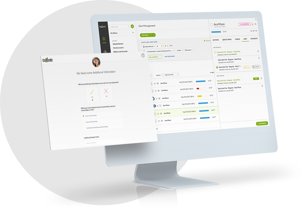
The answer is creating a comprehensive and individualized online registration system that allows you to incorporate effective communication techniques. Below are some tips to make your online registration effective!
Filter
One of the most important functions of a great registration system is the power to filter your information. A filtering system saves you time by taking tons of information and synthesizing it into a manageable and understandable picture to suit your needs.
When communicating with your applicants effectively the ability to filter out specific applicants based on what you are going to send out is invaluable.
Why would you send a “payment due” email to an applicant who has completed all of their payments? Being able to send helpful and relevant emails to those who need it, while leaving out (and not confusing) those who don’t, saves you tons of time in responding to all the questions your emails inevitably produce.
Spending some time initially to set up all the possible email combinations, including several versions of a deadline email notification for your different programs or different products, you might need to send out throughout your online registration system ends up saving you time in the long run even if it doesn’t seem like it at the beginning.
Setting up a calendar with dates you would like certain friendly reminder emails to go out goes a long way in organizing and managing this process. Then when that date arrives, send out a reminder to the appropriate applicants by filtering them out, choosing the right message and pressing the send button!
You’ve just sent out relevant, meaningful and helpful information to the right applicants!
Content & Style
You should always try to keep emails and messages as simple as possible! People read emails through their phone, on their iPad and on shared computers. You don’t want them getting bogged down in weird or funny graphics that might not appear on all devices or long, lengthy essays.
When your intent is to bring the applicant to action, have a clear and concise email that gives the most basic information and a link that will enable them to do the action right then and there. You don’t want them thinking “oh… this email is so long, I’ll just do it later”.
Because the reality is, they’ll never actually do it, or they will but only after more prodding and more emails and phone calls on your end.
Think of a few fun, bold and large sentences or titles, emphasizing the subject of the email that you can incorporate to help get your message across and engage the reader.
Clearly mark due dates and deadlines so they jump out at the reader and include helpful and obvious links when applicable. Short, to the point, clear and simple are your friends here.
A reader should be able to skim your email and get the gist that they owe this much money or this form needs to be filled out by a specific date. As a general rule, they should be able to click a link and complete the action right away.
Here is where data binding really comes in handy. Data binding is a fancy way of saying “personalize”. Being able to personalize the email as much as possible is key to getting the reader to pay attention to your message.
Start out the email saying “Hey [name]”! If the email relates to a balance due, go ahead and present the exact amount they owe! Or link them to sign in to their online application to check the balance they owe. These time saving tips will make your applicants appreciate you and will feel as though they are being taken care of personally every step of the way.
Don’t spam your users!
Make sure that there is enough time in between sending out an email about something and reminding them again about the same thing.
While helpful and target-specific emails are important and helpful, you also don’t want to bombard your applicants with daily emails filled with reminders and deadlines. This will just overwhelm and confuse the heck out of them!
At Regpack we also do this really cool thing where we alert you, the admin, if you’re about to send an email that you’ve sent before to that applicant(s) so you avoid sending the same email multiple times.
Sending the same thing twice, especially in a short period of time, will easily confuse and frustrate your applicants so having a built in alarm system can help avoid the problem before you have one!
Lastly, make sure your email texts are slightly different. While having a consistent voice in your email communication with applicants is important, you don’t want to use the same wording in every email. This will give the impression you just copy and paste your emails and only change a few details each time.
The Personal Touch
The goal in having personalized, target specific emails to your applicants is to make them feel supported throughout the registration process and let’s be honest, to make them feel special.
While ineffective communication includes getting emails from every single applicant multiple times asking clarification questions, the hope is that through these reminders you won’t have to chase down applicants for the things you need especially at the last minute.
You will always have applicants who respond to your mass emails just to say “Thanks” or “I’ll send this in today!”. By taking a few seconds to respond with a simple “No problem!” or “Can’t wait to meet you in a few weeks!” you are letting them know there is a real person behind the system who cares about them.
While setting up this kind of online registration system and communication system might take a little bit of time, it in no way compares to the time you’d be wasting with an ineffective system. Coupled with passive tools like visual cues throughout the application process and a consistent look and feel between your website and online registration system, you are on track to effectively communicating with your applicants! Which saves you time and your sanity.
The goal of saving time and having a more efficient online registration process is so that you have the time for more important and meaningful communication with your applicants and time to spend developing, improving and working on your product!
Learn more about Regpack’s online registration process and request a free demo to see it in action!


