Welcome to Part 2 of the Regpack Blog’s Communication Series! We think Communication with clients is super important!
We’re presenting a 3 part series looking at all aspects of communication. Part 1 addressed what is communication and how we communicate in business.
Part 2 below goes into various forms of ineffective communication with clients we have seen throughout years of experience.
And Part 3 will conclude with how an online registration software can improve and revolutionize your communication internally and with clients!
We hope you enjoy the series!
In our last post we defined what communication is and the different types of communication you will have with your applicants, including your website, social media platforms and your online registration system.
We provided tips on which areas of communication are most important and how to correctly optimize and use these forms to engage productively with your applicants. Effective communication nets you more accurate applications that are completed on time.
We have a lot to say about effective communication, clearly. But what kind of communication is “ineffective”? Obviously not communicating at all is the big “d-oh!” answer. But what other kinds of communication can also be ineffective? Let’s take a look…
Ineffective communication with clients means you’re working too hard!
Ineffective does not mean you are not investing enough time and effort. Most often it is quite the opposite.
Ineffective communication will have you on your computer and phone all day trying to answer endless questions, clarifying problems or questions with clients as they encounter them on your site. It includes service issues with your online registration software that your ineffective communication created in the first place.
What does this mean? It means that with ineffective communication you will be working harder and your applicants will be confused and unhappy. Not really a good place to be in!
Don’t make your applicants work hard, ever.
We addressed in Part 1 of the series that communication with clients starts with your brand, visual tools and your social media efforts. But it is also, very importantly, a part of your registration process too!
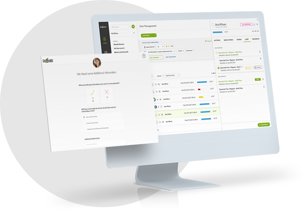
Having a confusing, one-size-fits-all online registration system makes understanding your needs difficult for applicants. There are very few programs out there where each and every applicant needs to fill out the same forms and pay the same amount of money.
Often times there are additional products or services that you are offering as well that further complicate the application process.
By complicated we mean, requiring a need for customization and a smooth transition from the main application to supplemental forms and payments. There are forms only some of the applicants need to fill out or are relevant only to applicants that are ordering something additional.
A one-size-fits-all online registration software and application will only cause your applicants to be overwhelmed and confused by all the non-relevant options and resort to calling and/or emailing you to clarify how much they owe and what forms are necessary for what they want.
This of course, is a waste of your valuable time (see the “you’re working too hard” section above). You should be spending your time when talking to applicants really communicating with them in other productive ways, like communicating with potential applicants about how great your products are instead of troubleshooting and problem solving.
Your application process should be smart enough to prevent that by making the process seamless and by presenting only the products your applicants are most likely to be interested in. It should automatically add forms, questions and payments that are pertinent to them and not present those they aren’t.
Making the registration process seamless is effectively communicating your needs.
A great example of a good intentioned but ineffective way to communicate with clients and applicants is using bulk email services. Confusing bulk emails sent out to all applicants is sadly enough a common practice that should really be avoided.
It’s ineffective, unprofessional, gives the applicant a sense you do not really care about him, and frankly it is too 1990’s for you to be doing it. There are a lot of technological tools available today that can help you make all emails personal and to the point, i.e. effective.
It might take a few more minutes to set them up and a few more to select the right people to send each variation of the message to but applicants will be informed by your emails, not confused. They will accomplish the tasks you ask of them in the emails, not call you to clarify what they need to do. And in the end, you will be saving yourself hours of work while improving your communication and saving time in the long run.
A one-size-fits-all email with tons of highlighted text, bolded sections and links to online forms will, if you are lucky, be deleted after reading the title or the first sentence (since your applicant thinks: “oh… this doesn’t refer to me, I did everything right!”).
For those that will actually read it, it is likely incredibly confusing since not all of the information contained in the email is applicable and relevant to them. And we all know what happens next. This is another example of where you are working hard and spending a lot of time on something and your applicants are unhappy, frustrated and confused (and probably checking out your competition for other options).
You will probably get an email from almost every recipient asking for some sort of clarification as to which part of the email applies to them, double checking what they have turned in thus far or how much money they still owe. Which of course means you have to look up their file and respond accurately to them to make sure that this time around, they will “get it” and will do what they need specific to their situation. Whew, that seems like a lot of work already. Well, it is.
Keep it simple.
A good but often overlooked tip in email communication with applicants is to avoid the fun graphics, videos and pictures. These tools are great for marketing! But have you ever seen those messages on the mobile devices that block all images by default?
Sending an attachment might also seems like a good idea but what happens if your applicant accesses their email through a shared computer that does not have the exact application needed to view the document?
Sending them a personalized email might not take care of these specific problems, but your applicants are more likely to keep a personalized email in their inbox until they are ready to download the right document, click on the link to their online application to fill out the uncompleted sections or click on the payment link at their convenience without having to remember mentally how much they owe.
You will see these tasks getting done quicker and accurately when a personalized email is sent.
So what’s the fix?
Obviously the quick fix is not sending bulk emails out!!! We aren’t saying, “don’t EVER send out bulk emails” because they are great in some instances. For example, when you have a message that every applicant needs to read, having a simple function that inputs their name at the beginning of the email (“Hi John” sounds way better than “Hey!”) is often all you need.
But when communicating about business, meaning the applicant’s status, what they owe, what is outstanding and important dates for products specific to a smaller amount of applicants than the entire group, bulk emailing needs to be put aside and a more individualized email needs to be put together.
The time it takes to set up this system is a bit of an investment. But once you put the work in and it’s done, you will save tons more time in the long run when your emails are clearer, more professional and 1000 times more helpful to the reader.
Creating a template that will then personalize their name, populate their specific program dates, populate their exact payment amount and link to all the right places (their application, the payment function, their dashboard or the right form) is the only way to effectively communicate with applicants.
There are other ways, of course, to ineffectively communicate with applicants. A great test would be to follow the advice from the beginning of this post. What are you spending too much time on and not feeling like you’re getting what you need back? Is there a way to change up what you’re doing that nets you better results with a smaller time investment? By taking a look at your processes and how you can streamline certain areas is a great way to improve on trouble areas, not just with communication, but in all aspects of your business.
Continue on for Part 3…


