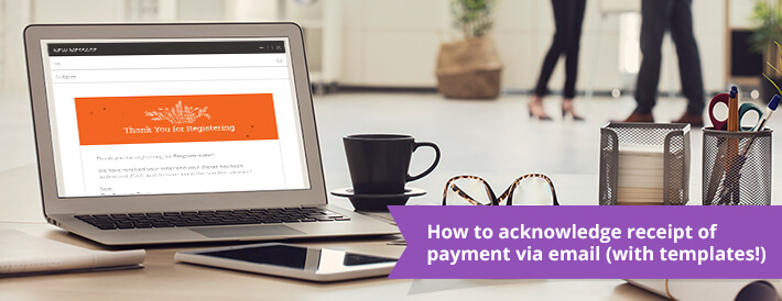
To continue with our ‘Email How-To” series, the last installments on Writing a Great Registration Email and Writing a Great Incomplete Registration Email, we give you: 5 Things that have to be in a great payment invoice email!
Writing an effective email to applicants and registrants when they have made a payment or completed their program payments is crucial in both informing your users and lowering your support tickets.
It cancels out confusion when your applicants are paying online, confirms the action they just did and finally, and most important for you, lowers the number of support calls and emails you will need to deal with surrounding payments. Here’s a great resource for getting paid on time.
Jump to any section below:
The Five Key Aspects of a Good Payment Acknowledgement Receipt Email
TEMPLATE: Payment Receipt Acknowledgement Email
What should you avoid when confirming payment via email?
Why is confirming payment effectively so important?
The Five Key Aspects of a Good Payment Confirmation Email

Acknowledgment of the payment
This might be obvious, but don’t forget to actively confirm the payment, including what the payment was for, the date it was made, the amount, and all key payment details.
With a good payment software, you will be able to customize these details, how they appear and in what order so it’s as exactly as you want it to be.
Updated Account Balance
Giving the registrant or applicant updated information about their account balance (which also acts as an additional acknowledgment that the action succeeded).
This should be easy to configure with your software, and is a good detail to include to confirm in each payment receipt that the balance is paid in full, or if there is an outstanding amount. Especially if you are using payment plans, it’s great to show upcoming payment dates and amounts and other balance details.
Update on their order – What they’ve paid
In addition to giving the account balance, the email should include their full order details and any updates, including every item or session they’ve ordered.
Giving the registrant or applicant an update on their order including what they have paid so far and what is still outstanding improves overall client communication and can lower support cases due to lack of information sent to the client.
Information about how they can view their order
Information about how the registrant or applicant can view the information online. If you have a way to view payments and their overall information, like a dashboard, online, include this link in your email.
This will lower the number of phone calls and emails you’ll receive asking for this information that can be easily accessed online on their own.
Contact information for your payments team
Contact information for your payments team can and should be included into the email signature if the registrant or applicant has any questions.
Don’t make it hard for a client to get in touch! This can be frustrating and it’s always a good idea to make connecting with you as easy as possible.
TEMPLATE: Payment Receipt Acknowledgment Email
Below is the email example many of our clients use when sending payment acknowledgment emails.
As you can see, the email implements all five suggestions we outlined above. The email is, of course, automated, so the user’s information and payment details are automatically populated into the text (which means one less thing for you to do and another reason why an automated online registration software is worth its weight in gold!)
GREAT Payment Confirmation Email
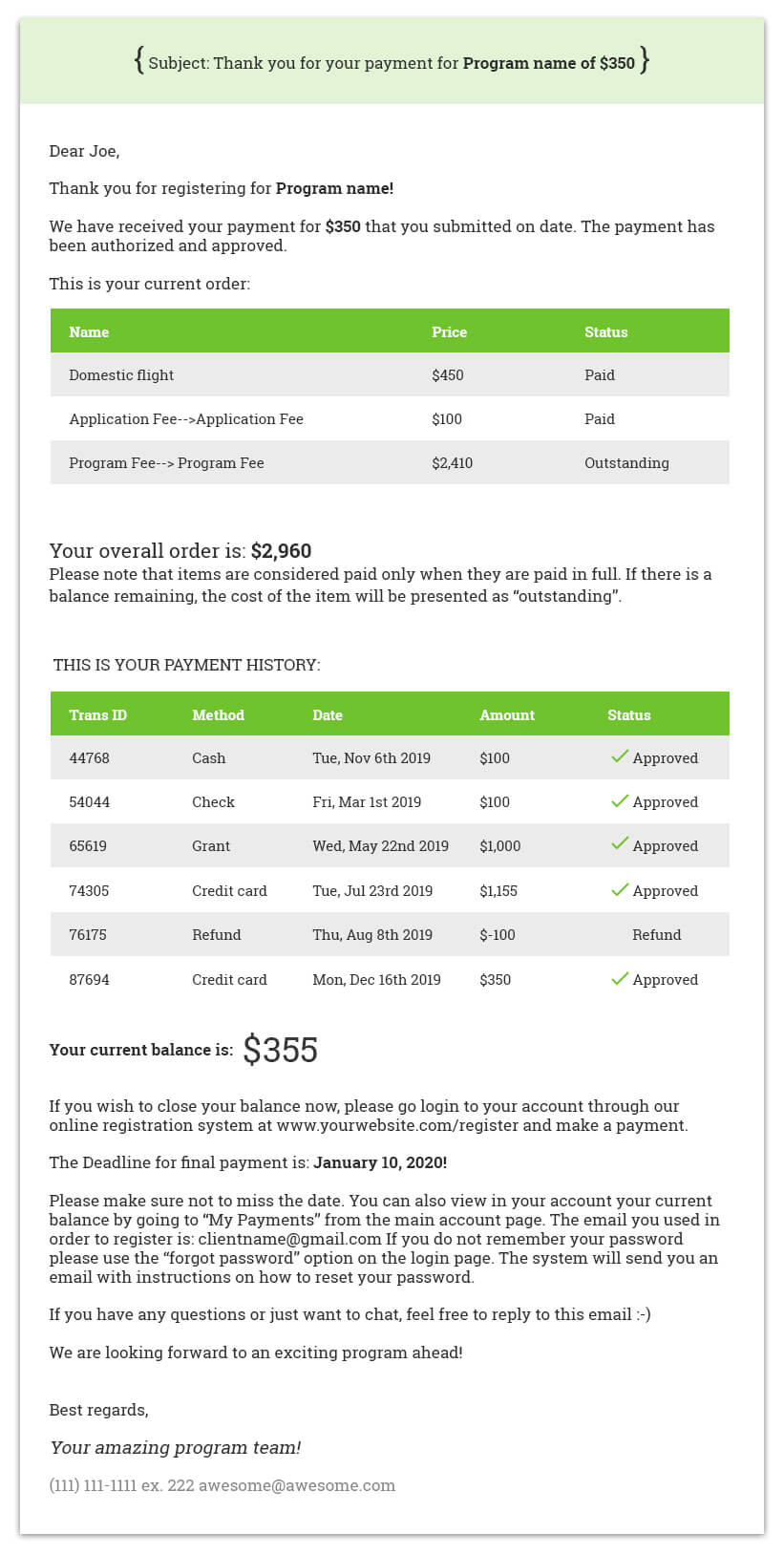
What makes this a great payment receipt acknowledgment email
There is a lot going on in this email, so we want to highlight the most important sections so you know what is really important to include in your own emails.
1. Clear acknowledgment of the action they just completed.
You’ll notice that the very first line of the email (sometimes the only part the reader will read completely and the part that will show up even if they do not fully open the email) confirms that a payment was just made and that it went through.
When they make a payment online, they will probably go and check their email immediately to get their confirmation (as most online stores and payments operate this way). Giving them this information in a clear and detailed way is helpful and appreciated.
2. Overview of their account and payment activity
The great thing about automated emails is that you can include so many details in emails to your applicants and registrants without the hassle and time it normally takes to copy and paste that same information into each email. This email provides a detailed list, should the reader be interested, of their past payment history as well as any outstanding balance.
Everyone is different, so providing a link for people to visit their online profile and view their activity is great, but also including it for them right there in every email really goes above and beyond. If this email happens to be the final payment to close their account balance, the reader just has to hit ‘print’ and has their complete invoice and payment history that they can file away for their own records.
With an integrated payment system and automated communication system, this step takes no time on your part but makes your communication look polished, prompt and professional. By also including the products they’ve ordered they can easily check that they are enrolled in the right programs and correct any mistakes in their account should they exist.
It will also act as a way for you to upselll since if they might have wanted to purchase a product and forgot they will see that it is not in their cart right away. Basically, everyone loves to know where they stand and the information provided here accomplishes that.
3. Important Links: Going the extra mile!
Your email, just like our example above, should always include easy to find links to the following:
- Their online account and dashboard page (specifically, the page they can make a payment and view their account)
- Your email address
- Your website
- Your main social media pages (Facebook, Twitter, etc)
With this email as an example, this recipient has an outstanding payment due so providing the link for them to quickly and easily make a payment online is the best way to ensure the reader will make a payment on time without you having to track them down via email, phone, etc.
Hopefully your email and supporting payment documents available on their dashboard are enough to encourage the applicant to make their final payments on their own. But in case, including easy to see emails or phone numbers that they can contact you directly if they have a problem or general question about the payment goes a long way in the customer service department.
No one likes having to search and search for contact info, so make sure it’s right there so if they do want to call you, they’re in a good mood because it was so easy to find your number and not a bad one because they just spent 20 minutes locating how to call you!
Always assume people don’t read your email from beginning to end, so make this information easy for them to locate and understand. So that’s what a ‘good’ or effective payment email looks like. So then…
What should you avoid when confirming payment via email?

If you have a user who just made a payment, DON’T send them an email that just says thanks. Obviously this is better than nothing but it will most likely generate a return email asking to confirm what their balance is and exactly what they ordered (according to our data it will do so 63% of the times!)
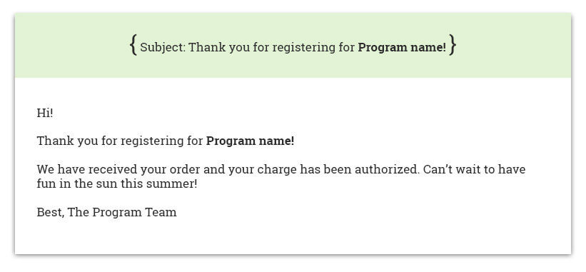
What’s wrong with this email?
The email does confirm that the payment the user made just went through and there weren’t any problems. It also mentions the program name.
While it does tick those boxes, it fails to inform the registrant if they have an outstanding balance or if they are all paid up. It doesn’t even show the amount they paid so if they are making multiple payments they will get the same email again and again and will not know if this is acknowledging the most recent payment!
It also doesn’t give them any further details about previous payments or what they are paying for (i.e. a breakdown of what programs and other products they’ve ordered or registered for). And it provides no links to check out their online account or to your website! Basically it only one thing in our list of things your email must include: acknowledging the action. And it does that very poorly.
The theme here is a lack of information and not using an automated email system to it’s fullest potential. When in doubt, less isn’t more when it comes to payment emails. Many people will use this email as a form of a receipt or print it out or file it for their own records.
Having a history of payments, confirming their latest payment was approved and communicating a final balance when applicable so they can make a final payment towards their account is KEY to getting paid on time and maintaining a productive line of communication with your applicants.
Why is confirming payment effectively so important?
If your applicant received these *bad* emails the first thing they’d probably do is hit reply and inundate you with a bunch of questions that could have been answered with a better structured email (like we said, according to data we gather at Regpack it is an amazing 63%(!!!), that is a lot of emails to answer and a lot of time waisted).
Most people would respond, “Do I owe any more money?”, “when do I owe it by?” and “how can I pay?” Or worse, they won’t reply at all because they will assume they have paid in full and you’ll spend your time towards the end of registration running around trying to get everyone to pay their full balance. By including this information in your emails, most people will understand what is expected of them and complete any further action that you require.
You will of course still have people in touch who want to verify information or ask further questions but that’s ok. No matter how automated your registration or application process becomes, there will ALWAYS be a minority of applicants who need their hands held a bit more than the rest.
By freeing up your time for savvy people who would otherwise (with a great email) take care of things themselves, you now have time to give your attention to a more needy registrant. Win-win-win for everyone (Who got that “The Office” reference!?!)
How can software help your payment confirmation emails?
While most payment processors will send an automatic email goes out from the payment processor with a confirmation of the payment, you cannot control the content of the email and include all the great things we suggested above.
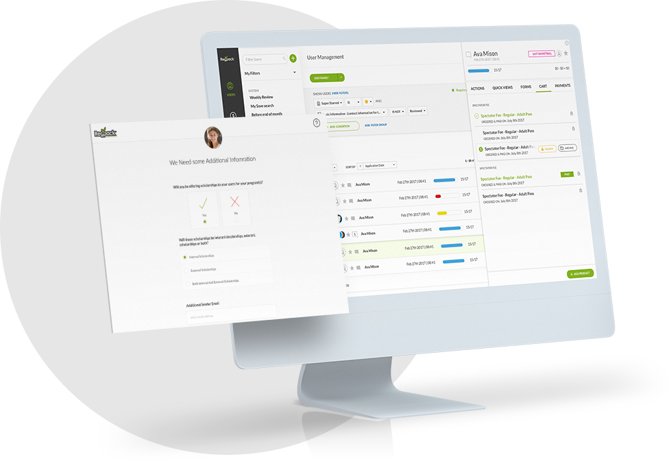
That is why a software that allows you to send a confirmation email with personalized tokens and other custom options is key.
Tokens can include the name of the product(s) ordered, the autobilling schedule selected, other registration details from the application as well as details about important upcoming dates and more.
Clients can also use a registration software to send any number of custom payment related emails, and payment reminder emails.
The essential functionality is that you should be able to filter for users (say everyone attending program a, who ordered product b and/or who have a balance) and then send a targeted, personalized email with payment information.
Happy invoicing!
** Feel free to use some or all of the text we provided above in the example, as part of your own payment confirmation emails in your own business. And as always, please share with us on our Facebook page or Twitter in the comments any tips or items of text you always include in your payment emails to ensure your applicants and registrants are happy and receive the info they need. We always love to learn 🙂 **
