According to The Manifest’s survey, only 13% of event attendees prefer to register using paper forms.
If you surveyed event coordinators, you’d likely get a similar result. It’s tedious to manage registration manually, from the long hours of paperwork to the mind-numbing data input.
To meet customer and staff demands, many businesses are automating the process by switching to online event registration forms, which are frictionless for users and easy to set up.
In this article, we’ll help you understand these forms and their different purposes, why they’re effective, and how to use them in a way that increases conversion rates and improves attendance at your events.
- Commonly Used Event Registration Forms
- Why Use Online Event Registration Forms
- How to Optimize Your Event Registration Forms and Convert More People
- Conclusion
Commonly Used Event Registration Forms
Event registration forms are commonly used for various types of events, including conferences, camps, trips, and others.
Your form’s ideal design and content depend on what type of event you’re running.
Here are some guidelines about what to include in forms for each type of common event:
| Conferences | Conferences last multiple days and have different sessions and speakers. When planning them, it’s helpful to ask attendees which parts they’re most interested in seeing, as this can help you gauge each session’s turnout. |
| Camps | Give some leeway for kids, or their parents, to customize their own camp experience. For example, let them choose from various activities or sleeping arrangements (roommate requests, cabin type, etc.). Also, it’s important to gather details about any allergies, fears, or issues administrators should be aware of. |
| Trips | Ask questions that help you plan a perfect trip for each attendee. Check their preferred accommodations, meals, seat type (first class, etc.), destinations, and anything else that will help you satisfy them. |
In addition to multiple types of events, there are also multiple types of people who must register via these forms.
The vast majority are general attendees, but there are also speakers and sponsors.
Below we touch on how to create forms for each of these types of recipients.
| Basic Attendees | Collect details about your attendees’ preferences so you can give them the best experience possible. Ask about their lodging, transportation, and dietary needs, as well as their preferred activities. |
| Speakers | Gather background details about the speaker that will help you advertise them as experts. This could be the title of their speech, accolades, or presentation type. Also see if they need anything from you, like technology, that will help the speech go smoothly. |
| Sponsors | Collect information that will help you promote their business at the event. This includes their social media info, their business name, mission statement, products, and more. |
Now that we’ve reviewed the types of events and people for which these online forms are relevant, let’s go over why your business should be using online event registration forms in the first place.
Why Use Online Event Registration Forms
Online event registration forms are more effective than other methods like paper, phone, or email templates.
By comparison, they save your business resources, simplify the process, improve data accuracy, and allow for easy customization.
All of this results in higher attendee conversion rates at a lower cost. Let’s go over their benefits in depth.
To Save On Resources
Using online registration forms, your team saves one of the most precious resources of all — time.
By providing an online, self-serve way for your customers to register themselves, you’re automating a big part of the registration process.
After you set up the forms, you’ll receive registrations passively, and, if they’re integrated with or a part of your registration software, the data will automatically go to the right place.
If you took the in-person route without online forms, you’d likely have to delegate this task to a person (another valuable resource) on your team.
They’d have to take calls, intake information, plug it into your database, send a confirmation email, and do all the other repetitive tasks involved.

Source: Smartsheet
Instead of investing all their effort in administrative work, the person could put it towards more critical functions like organizing an amazing event or reaching out to top-notch speakers.
And it’s not only your company’s resources that you’re saving. You’re also saving your customers time, and this is something they’ll greatly appreciate.
Actually, being able to self-register instead of calling may just be the deciding factor that gets an attendee to sign up.
To Simplify the Process
Using online registration forms just makes the whole registration management process easier on your team.
There’s less stress involved if you can easily create a form, host it online, and watch the registrations and associated customer data flood into your dedicated registration platform.
You can also make the process more effective by simplifying it. That’s because a streamlined process can be done over and over again in the same manner.
There’s not as much variability in the steps as you’d see in a phone-based registration process, where each conversation is different.
And when you can complete a process the same exact way a thousand times, you can start to run more scientifically-sound experiments with controlled variables and high sample sizes to find ways to improve the process.
For example, if you wanted to see if removing the phone number field would increase your conversion rate, you could easily do this over a month by A/B testing your forms.
This is much harder to do over phone calls where other factors like your employee’s tone of voice might affect the outcome.
But most of all, this process simplification, facilitated by easily created forms and automated steps, will give your team peace of mind and fewer headaches from unexpected issues.
To Have More Accurate Data
Using software with integrated registration forms enables you to easily collect pertinent data from attendees and store it in a searchable and filterable database that allows for analysis.
Most tools enable you to create forms with the questions you need answered to provide the best experience and analyze customer needs.
You can also make it so the form cannot be submitted unless specific fields are filled out, like the red email field below:

Source: Regpack
And since the answers are typed, or selected from a drop-down menu, they’re rarely inaccurate.
You can even make it so that your forms don’t submit if an email address is inaccurately typed—for example, if someone forgot the @.
Compare this to a registration happening over the phone, where a staff member may forget to ask a crucial question or misunderstand an answer, both of which can have consequences later on.
For example, it’s easy to listen to someone tell you their name, spell it incorrectly, and later on send an email saying “Dear Elaine” instead of “Dear Elaina.”
While coming across as inaccurate to a customer isn’t a good thing, this example, of course, usually has only minor consequences.
But you can easily imagine intake error examples that cause worse effects on the customer experience.
If a staff member wrote down “vegetarian” instead of “vegan” as the dinner request, the hungry attendee might label the brand incompetent as they pick at their mac and cheese, when they’re lactose intollerant.
And it’s another thing entirely to have a large number of inaccurate data records that result in analyses that give you faulty conclusions and lead you to make misinformed business decisions.
These are just a few of the data-related reasons companies like to use online registration forms over manual registration.
To Customize the Process to Your Needs
Customization isn’t something you would find in registration methods like email or phone.
When you use online forms, however, you have various customization options that can be leveraged to better serve your varied customer base.
Common customizations include form font size, theme, color, branding, placement, the number of fields, which fields are required, the types of questions (multiple-choice, etc), and more.
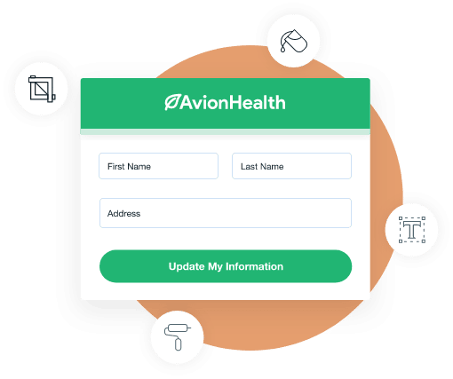
One of the most impactful customizations is branding. Designing your form with your brand’s colors, fonts, and logo engenders feelings of trust in your customers as they fill it out.
Source: Formstack
Some forms also come with something called conditional logic, which personalizes the registration experience for each customer based on their specific answers.
How it works is simple. Within your software, you essentially set up “if, then” statements that control which questions your customers see. An example outcome would look like this:
Perhaps one of your questions is “will you be dining with us?” One attendee might select “no” and see no further questions regarding meals.
Another attendee might select “yes” and then be presented another multiple-choice question that asks what dinner they want.
Because events are so unique, it helps to have these customization options to help you create an equally unique form that completely covers your data collection needs, while also providing a seamless, personalized experience.
How to Optimize Your Event Registration Forms and Convert More People
There are certain best practices you can follow to limit form abandonment, optimize conversion rates, and increase event attendance.
They are asking for only the necessary data, leveraging conditional logic, enabling group registration, and sending registration confirmations.
Let’s double click into each best practice.
Don’t Ask For Too Much Data
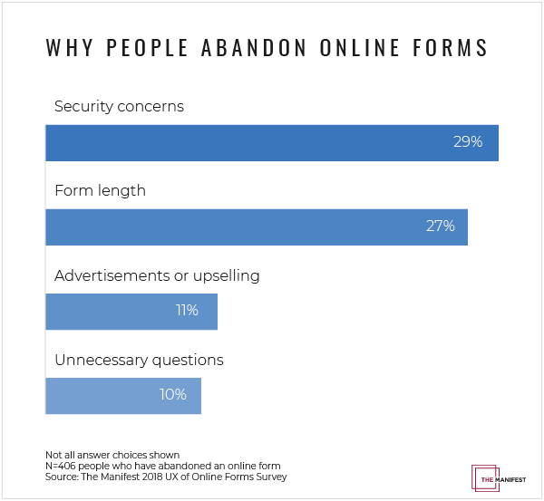
Unfortunately, 68% of online forms are abandoned by people after they’ve started filling them out.
The two most common abandonment reasons have a lot to do with asking for too much data. 29% leave because of security concerns, and 27% drop out because the form is too long.
Source: Convertica
A long form length is a consequence of asking for too much data. And the longer the form, the more frustrated or bored the customer gets.
As for security concerns, this can stem from multiple sources.
But one of the main ways to trigger a customer’s suspicion is asking them for too much data or asking them for information that’s not clearly relevant to the event they’re signing up to attend.
There is a simple solution to ensure your customers rarely abandon your cart for data security concerns or form length reasons.
It’s to keep your fields to a minimum by asking only for the most pertinent information.
As a rule of thumb, try to keep your forms to 2-5 fields.
A first name, last name, email address, and something else specific to your event or customer data needs is usually enough.
B2B brands should probably include “job title” or “company name” as well.
And if you need to use more than 5, just make sure that it’s evident to the customer why you’re asking these questions.
If you follow these best practices you should see low form abandonment rates and high conversion rates.
Use Conditional Logic
Conditional logic is a customization feature in many registration software platforms that greatly enhances the customer experience by showing users only the questions or information that pertains to them specifically as they fill out the form.
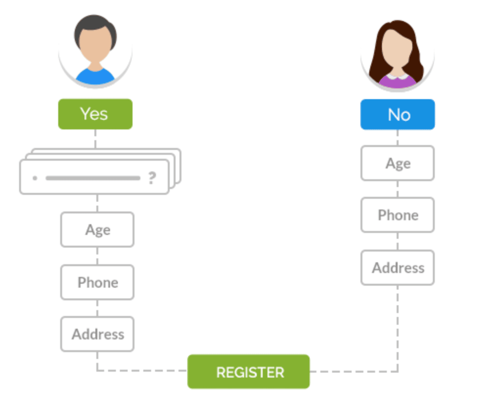
The feature runs on “if, then” logic—If a user answers A, the next question is X, if a user answers B, the next is Y, and so on.
Source: Regpack
As you can see above, the user on the left received an additional question because they answered “yes”.
The user on the right who chose “no” doesn’t see it and skips right along to Age.
You can configure the exact rules for your own forms. Although this may sound challenging, most registration software makes it intuitive and simple to set up.
For an example of how it works, let’s look at how one of our clients, a high school administrator named Gabriel Aguilar, used conditional logic to his advantage.
The school was trying to streamline the class registration flow for their students, so they set up a conditional logic that made it so that once students selected one of the four campuses, they were then shown only the classes offered at that specific campus.
That way the students didn’t have to see these fields that are irrelevant to them.
There was also the added benefit of also creating a shorter form for them, which tends to increase conversion rates.
In sum, conditional logic is one of the best ways to create more personalized, user-friendly forms, and increase conversions for your registration.
Enable Group Registrations
Often, one person registers and pays for an entire group.
This individual might be a group leader, such as a scoutmaster buying camp tickets for their troop or a teacher registering their students for a field trip.
There are other times when this individual is just the most motivated friend or family member in a group.
They really want to attend this event and therefore take the reins on the signup process in an effort to sell their friends on coming.
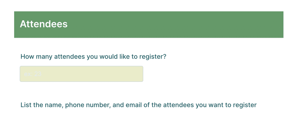
Therefore, your registration forms need to allow for group registration. When they do, you’ll increase your number of attendees and experience a lower abandonment rate.
Here’s an example form that offers group registration:
Source: Jotform
Most registration platforms will provide this functionality.
Some might also enable you to send automated welcome emails with tickets to the attendees who were registered by the individual, thereby making life easier for the person who registered who otherwise would have to give them the tickets.
Have a Form Submission Confirmation
Once guests have submitted their forms, they should receive confirmation that the transaction was successful.
This gives them peace of mind and a sense of security that their registration went through.
The most common types of confirmation are thank-you pages or success messages.
The former type is a page on your website that users are directed to once they’ve submitted a form.

Source: HubSpot
Often the page says something like “thank you for signing up for {event}. We look forward to seeing you!”
Companies often also then recommend some of their articles for further reading, or the option to follow them on social media.
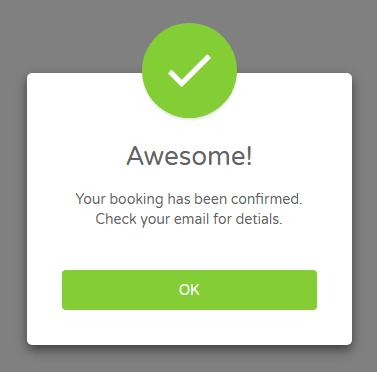
Success messages are the default type of confirmation on web forms. When the customer submits a form, a confirmation message will appear telling them they’re good to go.
Source: Tutorial Republic
You could also take confirmation a step further and send confirmation emails that contain all the information they need to prepare for, find, and enjoy the event, including any tickets.
Most registration software allows you to set up these emails so that they automatically go out to people once they’ve submitted a form.
Conclusion
With registration software, you can easily create succinct, professional online registration forms that react to your customers’ answers and display only the questions that are specific to them, while also allowing you to collect accurate data and streamline your entire registration process.
The reduction in administrative work alone is enough to make a switch from paper to online worthwhile.
You’ll have more time to create and enact your overall event strategy, instead of spending time registering people manually and inputting the data.
If registration forms sound like something you’re interested in exploring, check out how Regpack registration software can help make the switch a breeze.


