A good customer onboarding process is what makes or breaks a SaaS company.
As a user-focused business, you must strive to make it enjoyable. Customers are demanding, and they change their minds frequently, so keeping them happy and engaged is of utmost importance to keep your retention rates high.
No onboarding process is the same, but there are some steps you can take to minimize your churn and keep it as frictionless as possible.
This article highlights ten important elements that every customer onboarding process should have for success and rapid growth.
Jump to Section
Signing Up
Welcome Email
First Login
Tutorials for Product Setup
Empty States
Data Import
Educational Emails
Documentation for Hands-off Support
Celebrating Important Milestones
In-App Messaging
Signing Up
The sign-up form is your first contact with a potential customer so keep it simple.
People hate filling in forms, so the least amount they spend on your sign-up page, the better.
Most SaaS companies have adopted the same strategy when it comes to sign-up forms: they have a simple headline, a small number of fields to fill, and a call-to-action button.
In this way, they eliminate the unnecessary friction that affects churn.
Well, what works for most might not be helpful to you, but the most important thing is to maximize sign-ups and convert customers.
While it is essential to keep the customer focused and speed up sign-up, a great incentive that most SaaS companies use is interesting microcopy.
For those who are on the edge of deciding whether to give your product a try or not, an interesting value message that emphasizes the benefits of your product might convince them to click on that CTA.
Keep in mind that users are sensitive about the data they give.
Also, sometimes they don’t understand what they should put in the given form field. The effective use of short microcopy can dispel any questions they might have and remove errors that irritate the user.
After all, if the customer is not happy with the initial contact with your product, they aren’t coming back.
The great news is that more and more SaaS companies are implementing third-party authorization because it’s faster and gives your company more credibility.
If users see a brand they recognize (e.g., Google), they are more likely to sign-up for your service.
The data you acquire is invaluable because it allows you (with the customer’s permission) to market your product and personalize the onboarding process even more.
Here is an interesting example of a practical sign-up form from Shopify.
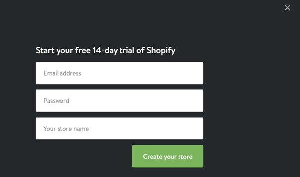
The form is very short, with only three fields to fill and a distinctive colored CTA. They only ask for an email address, password, and shop name.
Above the fields is a piece of microcopy with an interesting no-strings-attached motive for the customer to determine the website’s value.
Make the best first impression of your product with a simple sign-up form.
Welcome Email
Make your customers feel welcome since their first email and keep them engaged.
Emails, in general, are a great way to connect with your customers, but welcome emails are special.
They are your first direct contact with the customer, and you should do the most to present yourself in the right way.
If sign-up forms make the first impression of your product, welcome emails are the first conversation you have with your customer—you have to be interesting, engaging, and enthusiastic.
Your welcome email should deliver on the perceived impression and go even beyond that.
Keep the promises you made during their sign-up (discounts, extra benefits, etc.) and make the user feel like they’re a part of your team.
The best thing about welcome emails is that customers actually like them and expect to receive them.
Some studies report that 8 out of 10 people open their welcome emails when they get them. And almost 25% of them click through to the company’s website!
All SaaS companies should make the most out of these numbers because this is the starting point for successful customer retention.
If one welcome email works, then sending multiple is better, right? Wrong!
Your customers expect one welcome email that will simply let them know that their sign-up has been successful and are now waiting for you to tell them what to do next.
Sending a single email with essential information to get started is better than bombarding them with several emails. Sum up everything you need to tell them in one short email.
An excellent tip to remember is personalization.
It’s far more exciting to receive something with your name on it and looking like someone was thinking about you. There’s no difference with email.
Using the customer’s name in the subject line is a good start, but you can do so much more than that.
Send different emails to different types of users, e.g., the customers who signed up for a freemium plan vs. the ones who have a paid plan.
You can also base your emails on product use-case (personal, business, education, etc.). The opportunities are endless.
Here is an excellent example from Zapier’s welcome email.
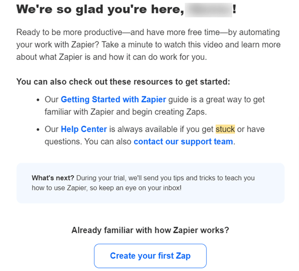
Their email is short, points out the next steps to get the customer started with their account, and informs them about upcoming emails (tips) for their chosen plan.
A big CTA button further invites the customer to engage.
Welcome emails are an indispensable tool in the customer onboarding process because they are the users’ first actual contact with the company.
First Login
Use the first login experience to best showcase your product.
Give the user a clear path in what to do next.
They have never seen your UI before, and they might get overwhelmed by the number of buttons, features, and empty spaces to fill.
A few helpful pop-ups should notify them why they are here and what the next steps are.
Setting up a combination of a progress bar and a checklist is a practical way to motivate them further to get familiar with your product.
Provide them with several quick wins to set a positive first impression of your product and lead them to their first Aha! Moment.
Positive encouragement should help the onboarding experience be as enjoyable as possible.
Make your customers feel welcome and thank them for coming this far by using pop-ups or modal windows.
That way, the customer has feedback on their actions, and they are motivated to finish their onboarding.
Mention has a great first login strategy.
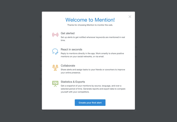
They eliminate the anxiety of seeing an empty interface, and use a modal window to assure the customer with further instructions.
A welcoming piece of microcopy triggers positive emotions, and a customer is ready to start with the given tasks.
Mention offers four actionable steps through which the customer can determine product value and continue their onboarding. A conveniently positioned CTA motivates them to begin exploring.
The first login is a crucial moment where the customer determines your product value, and you should make it as enjoyable as possible.
Tutorials for Product Setup
After the first login, guide your customers through important key features of your product with video tutorials.
Here’s a fun fact you may already know: video content is extremely popular among users.
Consuming video content has increased during the COVID-19 pandemic, with 96% of users reporting their watch time has increased dramatically.
When it comes to SaaS and its marketing strategies, a shift towards video content is in order, especially product tutorials.
Watching a video is far more engaging to customers and makes them spend more time on your product.
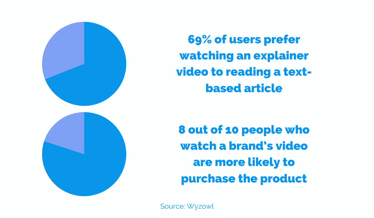
For instance, in the aforementioned study, 69% of users shared that they prefer watching an explainer video to reading a text-based article.
When it comes to improving onboarding strategies, we should let the stats speak for themselves.
As many as 87% of video marketers say that, in general, videos were a good investment.
Another useful find is that 8 out of 10 people who watched a brand’s video were more likely to purchase the product. This all applies to video tutorials as well.
Good onboarding with engaging and helpful video tutorials has helped MRR in most businesses.
Not only that, such videos have reduced the costs for customer support because the customers were able to understand the product better on their own.
Using video tutorials helps customers learn about your product faster.
You can explain complex ideas quickly because you are putting yourself in the user’s shoes and have to see your product from their perspective.
However, sometimes, people will just skip your walkthrough and then forget which features do what.
The use of micro-video is an easy solution to get them back on track and learn at their own pace.
Tips for Creating Engaging Tutorials
When they have engaging content and help at their disposal, users are more eager to continue the onboarding.
How do you provide this?
First, you can include videos in your tooltips.
A lot of users find them helpful when navigating a UI.
Using only text might be boring for your users, so try to implement micro-videos whenever you can (and if it makes sense for more complex features).
It will save your customers’ time, but most importantly, it will show them how to do something particular.
Second, put people in your tutorials. Personalize your videos.
People are more likely to listen to advice from other people than from computers. If they see a person giving them advice on using the product, they will feel like the customer service is more personalized and hands-on.
Educating your customers through video can be a cost-effective and sensible way for a good onboarding experience.
Empty States
The term Empty States refers to pages where content can’t be displayed to users. They usually appear when there are no matches in a search or there’s an error.
As a SaaS business, you worry that not giving the people what they want right away might hurt you—especially since your business depends on the service you provide.
Nevertheless, with the clever use of UX and UI, even empty states might boost your sales and retain customers.
The most common empty state is right after the first login.
There is no data that the product can use and help your customer achieve their goals.
With a clever choice of words and visual content, you can nudge them in the right direction to start interacting with the software.
Look at it as an opportunity to educate your users.
It is important that you have some form of encouragement or a tip to motivate them to act. If you don’t, they won’t do it on their own.
And when that happens, they will get frustrated and leave.
Trello has a great way of prompting its users to fill in new data by using dummy posts.
They help the user see how their interactions will affect the website, how they can use it and reach their Aha! Moment.
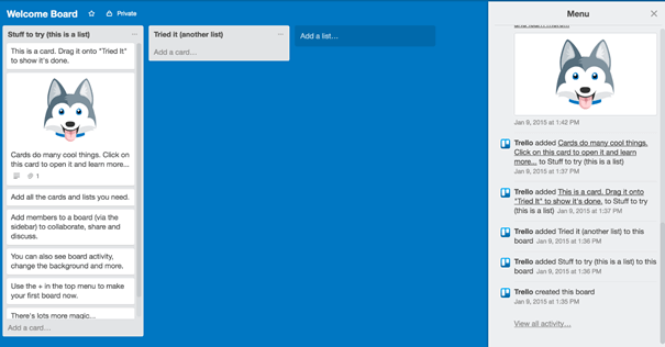
On the left side of the screen, the user can see a „Stuff to try“ column with suggestions on how to start using Trello.
There are actionable steps users can try to navigate the UI and test some key features.
“Click on this“ or “add this“ are simple nudges to ensure that the customer uses the website in the right way.
Your primary focus should always be to keep your software functional, but you should also make it look nice.
Through empty states, you can display the personality of your product, add interesting visuals, and microcopy. It can also be used to entertain and alleviate frustrations.
When creating empty states, they must be visually simple. A customer has encountered a problem, and too many suggestions might overwhelm them further.
Some of the best empty states stick only to the basics, so use minimalist design to point out essential information and combine it with attractive visuals.
Here is a great example of just such an empty state from HelpScout.
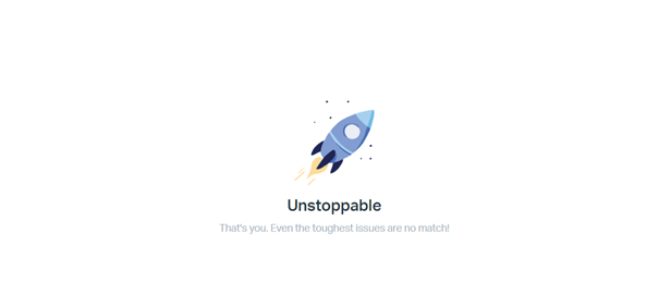
The user has no new messages in their inbox, and the website notifies them with an empty state.
It has a piece of short and engaging microcopy and an appealing illustration for a more entertaining experience.
Whenever possible, avoid dead ends in your empty states.
Users are still learning about your product, and you don’t want to confuse them further if they do something that your product can’t find.
Have helpful reminders in your empty states on what to do next to continue their onboarding journey. Avoid friction at any cost and guide your customers to meaningful action.
Utilize empty states to your advantage by making them helpful, engaging, and visually pleasing.
Data Import
For most B2B SaaS, data import is a vital step towards perceiving value in a good customer onboarding process.
Most B2B SaaS relies on their customers to import data for their product to work. This is also the most significant source of churn since the friction levels are incredibly high.
Your users might be bored with this step since it requires additional work on their part.
This is especially true if the data they need to import is scattered through several different apps, spreadsheets, or documents. Most of them will simply give up.
Therefore, it is important to make it easy and simple.
Let’s face it; it’s a far better customer experience if we have to click once and all our relevant data is readily available than if we have to sit for hours and drag and drop each spreadsheet from our computer.
You want to streamline the experience.
If it requires minimal effort, your customers will reach their Aha! Moment much faster, and their onboarding experience will be that much more enjoyable.
An effective data migration process can also help you with more sales.
For your B2B SaaS, you must prioritize your data importing process. Easy data importing will benefit your sales pitch and become an incentive for more customers to join.
Secure more deals by removing the most common data importing obstacles.
Whenever possible, try to minimize the user’s involvement in this process.
Use some pre-built importing solutions or create a customer success team that can collaborate with the user for a faster data import solution.
If nothing else helps, make an easy and simple how-to guide that will instruct your users to make the process as frictionless as possible.
Also, make sure that if users make mistakes during the data import process, the error messages you send them are actually helpful and detailed to get back on track and fix the issues themselves.
Here’s an example of an easy data import strategy from ClickUp.
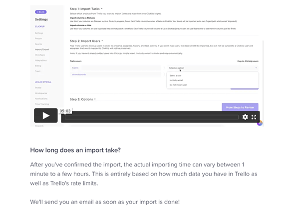
They offer a simple data transfer from their competitor Trello. There’s a short video tutorial so the customer can see which actions to take to complete the task.
Moreover, they state under the video tutorial how long this process will take and how they can further notify the customer once their data transfer is done (by email).
In short, they take the amount of data their customers might have into consideration and inform them accordingly.
Data import is an important process in customer onboarding, and you should take extra caution in how you approach this step. Creating unnecessary friction can increase your churn.
Educational Emails
Use the hidden power of educational emails to improve your customer onboarding.
Emails are an excellent source for customer retention and conversions, but it all depends on how you use them.
Your goal is to educate your customers on new features or re-engage them repeatedly, so send automated emails.
Only 12% of SaaS companies use triggered emails, so there are many opportunities to utilize this.
When you make your customers aware of certain features and how they’ll benefit from using them, they will quickly find value in your product.
Remember that for finding value, it is important that your emails are targeted.
Each type of customer will see value in different features, so the emails you send need to speak to the specific segments of your customer base.
Focus on targeting the following key segments:
- freemium members
- high-risk customers
- inactive customers
- customers due for renewal
For each segment, you’re personalizing their specific aspect of your overall retention strategy, and you can use emails to upsell, re-engage customers, and offer great deals to increase conversion.
You’re simultaneously educating them about your product’s new features and creating space for conversion.
One helpful tip is to use customer data to your advantage.
Segmenting will be far more manageable once you know your customers.
Use analytics to determine where and when users are likely to churn and what causes problems in their onboarding experience.
Is the sign-up process complicated? Which features do they use the most and the least? You can remedy all of that with targeted emails that raise and solve their concerns.
Here’s a helpful reminder: spam is the enemy of any good email marketing campaign.
After a good look at your customer’s data, you’ll know which type of email to send.
Create emails that will showcase your most popular features and those that might be relevant to your customers.
But also, once you show them how to use existing features, try for a quick upsell opportunity by showing them valuable results from your (other) premium plan(s).
Emails are a tried and true way to conversion, but it starts education.
Documentation for Hands-off Support
Having a dedicated knowledge base is an essential part of the customer onboarding process.
It’s no secret that SaaS companies struggle with optimizing their time to value.
Time is valuable, and when something goes wrong, the quicker your customers get to the solution, the better.
SaaS companies rely on guiding their customers efficiently, and even when something goes wrong, they should point their users to the right resources.
This will help keep users around for as long as possible.
If your customers are properly informed about specific features in your knowledge base, they won’t turn to your customer support so frequently and save time.
Onboarding is an ongoing experience, and some users like to learn about a product at their leisure.
Because of all this, it’s helpful to have a small hub or corner of your software to reference and find solutions to their questions and problems. Try giving them several options to keep them engaged.
Some popular methods are:
- webinars
- Q&A pages
- knowledge bases
- 1-on-1 customer support
Having a dedicated knowledge base helps position you as an information authority.
After all, it is your product, and you should know how to help your customer navigate through it.
If users have to go through third-party sources to find solutions, your credibility plummets—and so does their engagement.
One good guiding principle of a well-thought-out knowledge base is self-service.
The knowledge base should be available to customers whenever they need it, and it shouldn’t depend on their subscription plan (if they are freemium or paying customers).
Non-paying customers might be motivated more to convert once they get answers to their pre-purchase questions.
Another important feature for knowledge bases is their navigability.
UI and UX are all the rage, and prioritizing navigability significantly improves upon that.
Well-defined categories, search functionality, and FAQ help users find answers even to questions they didn’t know they wanted to ask.
An example of a good knowledge base is GetResponse.
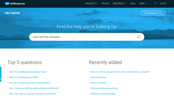
They have a large search bar at the top, and they divide their information into two categories, probably basing it on their customers’ frequently asked questions.
Topics are easy to understand and navigate.
Knowledge bases help both you and your customers in the onboarding process.
Celebrating Onboarding Milestones
Celebrate your customer’s onboarding milestones for better retention rates.
It’s easy to motivate customers who are already happy with your product and are actively using it. What about disengaged customers? They might not be dissatisfied with your product, but they aren’t using it to its full potential.
Those are your most significant source of concern because they are highly likely to churn.
Once the initial excitement of using a new SaaS product dies down, you must prepare yourself for retaining strategies.
You’ll remind your users of your product’s value and celebrate minor achievements in using your product.
Celebrating milestones will re-affirm the value your product has in your customer’s life.
Even minor breakthroughs in your customer’s progress are an invitation to celebrate for continued engagement.
Reward them with a virtual pat on the back for successfully setting up their account, finishing a to-do list, or logging in for the 100th time.
They help deepen the relationship you have with your customer and serve as a reminder that you’re thinking about them and care about them achieving their goals.
Another way to celebrate their engagement is to set regular progress reports.
They are highly personalized types of notifications that can help determine the value of your product over a certain period.
If your customers are not making significant progress, you can use the opportunity to remind them of the benefits of regular engagement. They can visualize their productivity and growth.
Here is a wonderful example from Canva.
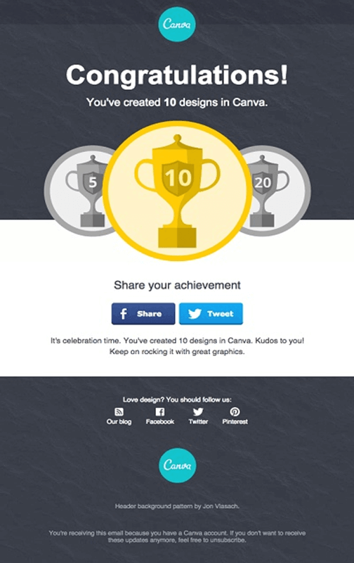
They’re acknowledging the progress their user is making while using their product.
The user can now celebrate their achievement by sharing it with their circle of social connections through Facebook or Twitter.
Canva is further motivating the user by showing them their next achievement: creating 20 designs in the software.
Well-made microcopy under social media CTAs is positive encouragement to continue using the service. It’s simple, attractive, and motivational.
Celebrating your customer’s milestones is an excellent opportunity to re-engage them and help them find more value in your product.
In-App Messaging
Keep your customers engaged with in-app messaging.
The name of the game is keeping customers interacting with your product and becoming paid customers.
In-app messaging is yet another method to keep your customers engaged and interested in learning about your product.
One study showed that companies that use in-app messaging had 3x higher retention rates than those who didn’t.
Just like emails, they can help guide your customer and answer all of their questions. They are even better than emails because they don’t require the customer to leave your UI, and friction is minimized.
Users are already familiar with online messaging and chat apps, so this type of communication can be perceived as convenient and informal.
We’ve mentioned the importance of personalization and segmentation before, but in-app messaging is brilliant in this way because you give highly contextualized messages based on the real-time activities of your users.
When something goes wrong, inform them; when something goes right, praise them.
Providing the right information at the right time can drastically improve a customer’s onboarding experience and steer them towards a paid subscription plan.
In-app messaging can also be useful to users who have no problem figuring out your product.
Letting them know about some advanced features or giving positive reinforcement can provide additional value and create an excellent customer experience, ultimately increasing your lifetime value.
Just like triggered emails, triggered messages are great for keeping customers engaged.
Connecting your messages to meaningful action or future goals is the safest way to keep your customers active and focused.
In this way, you can simply automate your engagement and leave it be. Your customers will be taken care of, and you can focus on other things.
Also, let customers control your in-app messages.
Though they might be helpful, some users, especially more advanced ones, won’t like getting too many notifications.
Give them the option to turn off notifications or reduce their number.
They can always turn them back on or find other solutions in your video tutorials or knowledge base if they prefer.
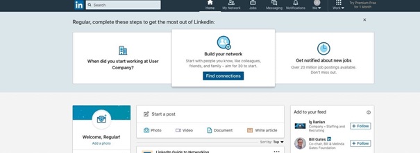
LinkedIn uses notifications during their onboarding so users can “get the most out of LinkedIn“.
They put some helpful tips on top of their page to inform the user about taking further steps in creating their profile.
With a helpful microcopy, they explain why each step is important. Also, users control what they see with an “X“ button provided in the upper right corner, above the notifications.
In-app messages can be a helpful tool to keep your customers engaged through the entire process of onboarding.
Conclusion
There is no best way to keep your customers engaged and provide them with an excellent onboarding experience.
But there are specific steps you can take that will certainly improve your existing efforts.
The first impression you leave on your potential customers is vital, and you can enhance it with a simple sign-up form, followed by a helpful welcome email and informative first login.
Expand the onboarding process with helpful video tutorials, knowledge bases, and in-app messaging.
Keep it interesting by implementing simple empty states and keep the engagement going with educational emails and celebrating milestones.
By taking these simple steps, you will drastically reduce churn and gain a lot of lifetime value.
