Let’s imagine someone is browsing the web for online courses to take. Maybe they want to brush up on a personal skill or maybe their employer has asked them to take a specific class. As soon as they find a course, complete the sign-up form online, and enter their payment information, they’ll head straight to their email inbox to confirm that the registration went through.
Whether you’re an employer providing online courses for your workers, an online platform that sells a variety of learning opportunities, or an association providing ways for your members to advance their careers, sending out course registration emails is crucial.
Course registration confirmation emails don’t just ease users’ worries on whether payment went through or the registration is complete, it also starts your engagement off on the right foot, sets the standard for communications, and relays any pertinent information needed to participate in the course.
You likely already know that leading course registration software can automate this process for you. It’ll send a triggered email based on applicant actions, like completing a registration or even making a payment.
But, the next question is— what should your course registration emails say? Should they be very short? Very long? In the middle and “just right?”
We at Regpack are here to help answer these questions. This post will take you through the importance of course registration emails, best practices to follow when writing them, and even templates for you to use as inspiration:
- Why Should You Use Registration Confirmation Emails?
- Best Practices To Follow For Your Course Registration Emails
- 3 Course Registration Confirmation Email Templates
Let’s dive in!
Why Should You Use Course Registration Confirmation Emails?
Course registration confirmation emails are necessary to prevent any confusion down the line, whether it’s about if the registration went through or about any essential course details. Sometimes, people think they’ve successfully signed up for an activity or purchased a product online, but they didn’t actually hit the submit button at the end of the form. Without the standard of confirmation emails, they might just assume that their registration went through.
As soon as someone completes their online registration process, your organization should send out a course email:
- To provide recognition of the participant and inform them about the basic course details, including when the course takes place, how to access it, what materials they’ll need, etc.
- To inform registrants about the successful and secure payment for the course, allowing users to breathe easy knowing that their sensitive data is safe.
- To encourage a registrant to continue interacting with the business or organization, whether that’s to sign up for a newsletter or connect on social media.
- To remind your registrants about any deadlines or other important dates for the online course.
You already know that course confirmation emails are a critical component of the registration process, but getting to the actual nitty-gritty of the message content is another challenge. Figuring out the best way to get your registrant’s attention and ensure important information is relayed can be done with some key communication and email best practices.

9 Best Practices To Follow For Your Course Registration Emails
When approaching your course registration confirmations, it’s essential to keep in mind the basic marketing and email best practices that your organization or business likely already follows. Along with that, consider the specific information and details that you need to include in your email content to ensure success with the specific course in mind.
To ensure you don’t miss out on any criteria and that your course registration emails are the best they can be, explore the following best practices that we have put together.
1. Personalize The Emails
Personalized emails equal higher conversion and open rates. “Conversion rate” is just a fancy way of saying you got the recipient to do what you wanted them to do— open the email, read it, click a link, etc.
In the case of these emails, you’re likely notifying them that registration was started or completed, or that they have incomplete forms or a balance due. Your course registration email should guide the applicant to their dashboard to check their status.
One way to personalize an email is to use tokens. Tokens are basically the spaces in your course confirmation email that are populated by information from your database. The “First Name”, “Course Name”, “Balance Due” and “Incomplete Forms” tokens are used most.
Using tokens not only makes the person feel the email was sent just to them by including personal details, like whether the balance was paid or dues and forms completed, but they also help get the person to do what you are asking. Readers can easily determine that the email is for specifically them and not just a mass message.
Make sure your course registration software offers the ability to populate personal information into your email messages, as this is one way online registration software saves you a ton of time! Instead of sending out a personal email one by one, you can send relevant and personalized emails to hundreds of people with a few clicks.
2. Include Contact Details
Course registration confirmation emails are also an opportunity to open up a channel of communication between registrants and your organization. Your registrants should be able to ask any pertinent questions when they arise, so ensure you include contact details for your organization or an assigned staff member.
A few things to note:
- Make sure you send your emails from an email address that makes sense and that can receive replies. At Regpack, for instance, we send out a weekly email to our email list from an email “newsletter@nightlyregpacks.com”. This is relevant for the type of message being sent, but we also monitor it for anyone who might hit reply to ask a question or give some feedback.
- The signature includes email, website, and phone number. If someone wants to respond, they will probably hit reply. However, sometimes they look to your signature for more contact options. Providing this information where it’s easily found is part of overall great customer service.
The goal with this is to make sure your applicants can contact you quickly and easily if they have questions about registration, payments, or your programs. Creating this open channel of communication is also a great way to lay the foundation for a long-lasting relationship with registrants.
3. Ensure Important Information Is The Focus
Most people don’t read a full email from beginning to end. Make sure the meat of your message stands out. If their eye is drawn to their balance due, they will understand they have an action item and get on it!
To ensure that any essential details aren’t accidentally ignored, consider:
- Bolding important dates or deadlines in order to draw the eye to them
- Using colorful buttons and graphics to capture the registrant’s attention
- Minimizing the use of unnecessary text so readers are not too overwhelmed
Your confirmation emails’ core purpose is to relay important information. Make sure you can do that with these tips.
4. Embed CTAs With Links And Buttons To Target Actions
Often, a course registration email is sent out with a target action in mind. If this is the case, using calls to action (CTAs) like links and buttons are some of the easiest ways to focus your reader’s attention and encourage them to click through.
No matter the target action, it should be clear how to do it. For instance, if you want the registrant to update their sign up status, make it easy for them to find and get to their online dashboard. Using a bright button with a link to the dashboard can be a nice touch.
The goal is to just make your call to action obvious and easy to spot. If you are implementing a button, consider using a filter. This will create a few different versions of your email to send to specific groups of people, such as:
- Those who have started, but not completed registration
- Those who have completed registration
- Those who have a balance due
You can filter for each group and then send them an email with a button text that speaks to their situation, like “Make a payment” or “Complete your forms.”
If the recipient sees only one thing in this email, it should be the action requested.
5. Include All Relevant Course Information & Reminders
This is an obvious one, but you don’t know how often businesses forget to put basic details in their confirmation emails. Because an online course might consist of multiple sessions, a specific Zoom link, or even an orientation, it’s crucial that your confirmation emails relay all of this information.
However, you don’t want to overload the email with information. Sometimes, people are just looking for that confirmation of their payment going through.
This is a great point to mention that knowing your audience is key! If you think that too much information will backfire, then don’t include additional details. If you find that you’re getting more questions, then incorporate more information until you find the right balance.
6. Provide An FAQ
A lot of times your course registrants are going to have questions. Whether questions about the course itself, how to access the course, or about other courses, there are queries that frequently arise.
If you often find yourself in this situation, consider providing an FAQ within your confirmation email. This is optional and a case of “how well do you know your audience.” If it’s okay to add more information, then include a few common questions and answers in your email to try and cut down on responses that will take up your time and fill your inbox.
Common questions to answer in your FAQ are:
- When is the registration deadline due?
- How can I reset my password?
- What do I need for the online course?
7. Keep Formatting Simple
It is best practice to use simple formatting when sending marketing emails.
As mentioned before, you want the important information and target action to be the focus of your confirmation email. Don’t go too overboard with how you format and design this email as it might draw away from the main point.
Create a simple text email with links, bold words, maybe a button and that’s it! It’s all you need for an effective email.
8. Optimize For Both Desktop And Mobile Use
Everyone reads their email on different devices, whether desktop, smartphone, or tablet. With different email providers and formatting across all of these options, this can make for some wonky email formatting! By keeping your formatting simplistic and vertical, you increase the chance that it can be read on any device.
Choose a course registration software or email marketing platform that will automate this process for you and format your emails to look good on any device.
It always helps to not over format your email, but at the very least, it should adjust to be the size of the recipient’s screen.
9. Use Online Registration Software
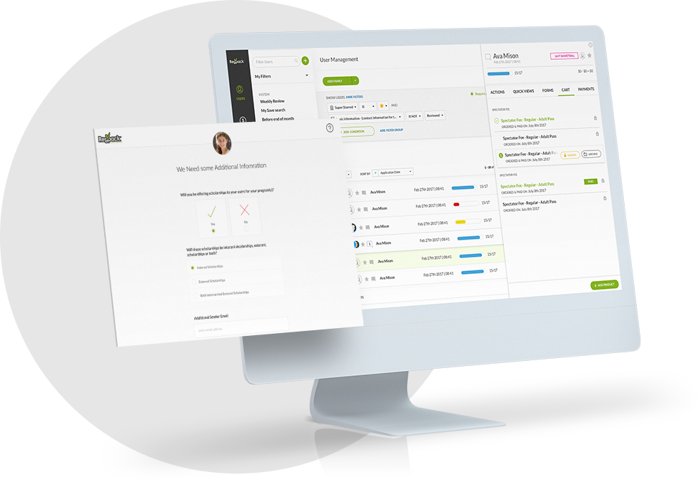
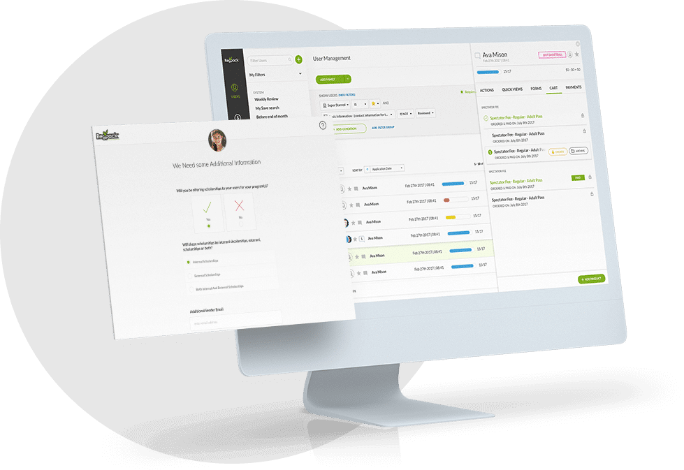
The tools you use to create course registrations and send confirmation emails out can help you with all of the above best practices. A tool like Regpack can make this entire process easier for both you and your course registrants.
Our top features include:
- Automation of personal details in emails
- Triggered emails sent based on target actions
- Ability to include buttons and images in email content
- Email recipient segmentation to create more targeted content
Putting together an email that tells an applicant what action they’ve done, what they still need to do, and other important information will help to keep everyone in the loop and get everyone on board with the process. Keep reading to see some of our email templates and these best practices in action.
3 Course Registration Confirmation Email Templates
If you still don’t know where to start with your course registration emails, we’ve compiled some templates to provide you with inspiration. Feel free to use any of these templates for your own emails, but remember to tweak them so that they match your online offerings.
Registration Confirmation Email Template Option #1
Hi Applicant Name!
Congratulations!
You’ve successfully completed registration for Course Name. Your registration is confirmed.
Below is a list of forms completed as well as your balance.
Any form in red needs to be completed and your payment balance should be paid no later than Session start date.
Forms Completed Token
Forms Not Completed Token
Payment Balance + Payment Plan Schedule Token
If you’d like to review your registration forms or view or make a payment, you can do so on your dashboard. Log in with the email you received this message at. If you do not remember your password, simply click the “Forgot Password” link and follow the prompts.
| access your dashboard |
If you have any questions or concerns, feel free to contact me at email@awesomecourses.com or 222-222-2222.
Best,
Your Course Team
What This Registration Email Template Does Well
Here is what we love about this course registration email template:
- You can clearly personalize this with tokens that fill in the bolded text
- There’s an eye-catching CTA button that provides access to the dashboard and empowers the reader to complete the target action
- Contact information for the course team is included at the end for any essential questions or burning concerns
Registration Confirmation Email Template Option #2
Dear First Name,
Welcome to Course Name!
Thank you for registering!
If you need to make any changes to your registration, click here. From your “Dashboard,” you can make any changes needed.
We’d love to invite you to our Orientation. Dates and times are below. It’s a great opportunity to meet your instructors and other students. You can learn more about what this program will be like and ask any questions you have.
We’d love to see you at 12345 Main Street on:
Sunday May 1 at 3pm
or
Sunday May 8 at 3pm
Note the payment deadline of Friday March 31 at 5pm.
All balances must be paid in full by this date. We recommend you pay in full NOW or choose an automated payment plan so you won’t forget to pay on time. You can do this through your Dashboard as well.
Your current payment balance is: BALANCE
| Go to Dashboard |
Please call us with any questions about payment plans, orientation or registration, at 333-333-3333. Shoot an email to info@awesomecourses.com too!
We are super excited to meet you and hope you are too! We have an amazing program, amazing staff, and most importantly: amazing students like you!
Best,
Awesome Courses Director
What This Registration Email Template Does Well
This registration confirmation email has a little more detail than the first one. We love this because:
- There’s a button CTA for users to easily update their registration status
- The email effectively reminds readers of important orientation information and even the payment deadline
- A nice touch is the personalized current payment balance
Registration Confirmation Email Template Option #3
Dear First Name,
Thank you for starting your application! We are looking forward to having you for the Program Name this year.
As of today, the following forms are not complete!
Here is a list of your incomplete forms:
Guardian Information
Sign Terms and Conditions
Pay Deposit
Pay Balance
In order to hold your space, please complete the application via the link below.
| Complete Your Application |
Login with this email and password you created. If you don’t remember your password, simply click “Forgot Password” to reset it.
Here is some helpful information so you can complete your application ON TIME!
The deadline to complete your application is March 1st.
Questions with a red circle next to them must be filled in. Make sure you complete all mandatory questions. The form will not mark complete until this is done. You can check your dashboard here to see which forms are still considered Incomplete.
If you have any questions, just hit “reply” to this email!
If you don’t plan to complete this application because you will not be joining us this year, please reply to this email and let us know so we can open this spot to others.
Please don’t hesitate to contact me with any questions or concerns regarding your application.
All the best,
John Smith
Program Director
ph: (855) 377-7707
john@awesomecourses.com
What This Registration Email Template Does Well
This registration confirmation email gets straight to the point by describing the incomplete forms. We love this because:
- Links to all the incomplete forms are included so that users can quickly complete them and e-sign online
- The deadline for the application is bolded
- They offer an easy way to ask questions or talk back with a click of the reply button
Conclusion
Course registration confirmation emails aren’t just a suggestion — they’re a necessity for both you and your registrants. By following the above tips, you’re sure to have higher payment rates, higher conversion rates, and higher completed registration rates.
When you communicate effectively with your applicants, you are saving yourself time and making sure your courses fill up and are paid for quickly.
Take this to the next level by using the right course registration software, like Regpack, to make this even easier!


