Events empower you to bring your nonprofit’s community together, have fun, and raise money for your cause. But planning and marketing a nonprofit event can sometimes be challenging, especially if you’re launching a new event your community hasn’t seen before.
That’s where a well-designed nonprofit website comes in. The way that you present your nonprofit and its activities on your website can have a huge impact on the number of registrations you receive, and it all starts with the look, feel, and function of your site.
We’ve compiled some top tips for creating, designing, and highlighting your events on your website:
- Make Registration Easy to Find
- Focus On Your Registration Form
- Incorporate Striking Visuals
- Make Everything Mobile-Responsive
- Maintain Your Website
Whether you’re planning a large annual gala or a small school fundraiser, investing time into your website’s presentation will make a noticeable difference in the number of attendees who sign up. Let’s dive in!
1. Make Registration Easy to Find
The first step to take when using your website to market event registration is to make the registration form easy to find. The more ways you give your web visitors to land on your event’s informational and registration pages, the more likely they will be to engage with it (and register!).
In order to make your registration form easy to find on your website, you should:
- Use CTAs. Calls to action (CTAs) encourage readers to engage further with your website’s content. Your event and registration information are no exception. This means you should feature CTAs throughout your website that clearly present a registration link (for example, a “Register Now” button). The clearer you are about what you want your visitors to do, the more likely they will be to do it.
- Make your site easy to navigate. Be sure to use simple navigation across your website so each section is easy to find, including the events page. Many of your web visitors may also view your website on a mobile device, so keep that in mind when creating your navigation menu. It should be easy for anyone to find information on your event, regardless of the device they’re using.
- Keep things brief and to the point. If you include a long-winded introduction about your event and don’t quickly get to the pertinent information attendees need to register, you may lose some readers. Make sure your introduction is short and sweet (about one paragraph or so), shows what the event is about, notes the date and location, and explains how to register. Don’t forget your registration link CTA!
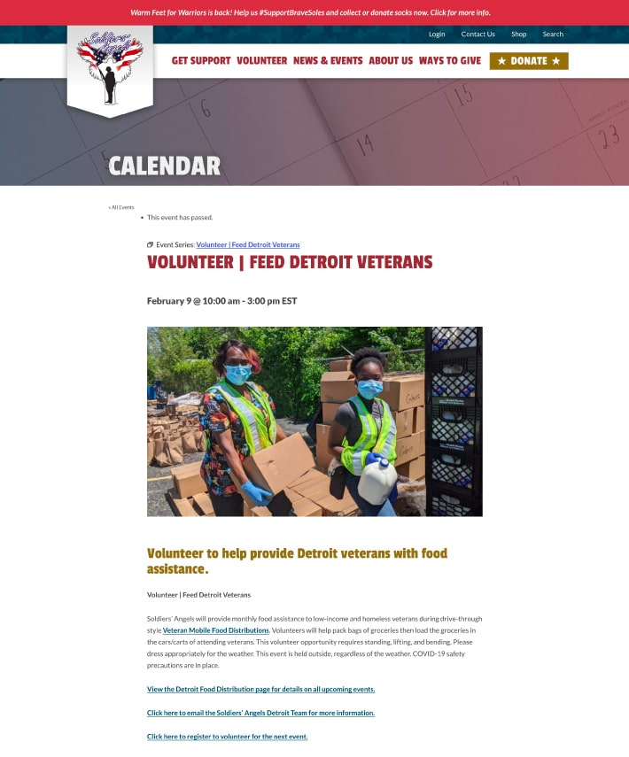
Here’s an example of a brief and effective event page on the Soldiers’ Angels website:

This page briefly introduces the event, presents the location, time, and contact information, and also offers registration information.
To see if your visitors are able to easily find your registration form, consider mapping out your event attendees’ online journey. Examine audience and user research to understand where your website visitors are coming from and where they tend to drop out of the event registration process. Then, you can focus your navigational changes and make them more effective in driving conversions.
2. Focus on Your Registration Form
As we’ve mentioned, your website needs to drive visitors to your actual registration form. But once they’ve arrived at the form, what’s next?
It should be easy for attendees to sign up for your event. This means you should leverage your online registration software to only ask for relevant information, present the form in a visually appealing way, and make sure the process is as smooth as possible.
More specifically, you should:
- Limit the number of fields. If you’re not going to use specific information, there’s no need to ask for it. Ask only the essential questions you need to process the attendee’s registration. This may include basic contact information, payment information, and anything else you can use while still maintaining the cleanest and simplest form possible. The fewer fields you have on your registration form, the more likely registrants will complete the process.
- Brand the form to your organization. Consistently using your brand elements is key to establishing trust in your supporters. According to Kwala, these elements include your name, color palette, typography, logo, and tagline. Using uniform brand elements on your registration form can help keep the design cohesive with the rest of your website. As a result, you’ll reassure supporters that they’re interacting with your organization and giving their information to the right place.
- Accept payments online. Does your event charge a registration fee? Are there other expenses that need to be covered? Accepting payments through a robust online payment system ensures you receive the money faster and in a secure manner while collecting important data and avoiding potential accounting errors. And even more than that, accepting payments during the registration process is convenient for your attendees, too.
Take your efforts to optimize your form a bit further by adding social sharing tools. This way, your event attendees can share their registration with family and friends and encourage them to also sign up for your event!
3. Incorporate Striking Visuals
We’ve discussed how your online registration form should be easy to navigate. But there is another element of web design that can also impact the number of registrations you receive: visuals.
Striking visuals can make all the difference in how engaging a nonprofit website is. Check out Cornershop Creative’s roundup of the best nonprofit websites to get a sense of how visuals can elevate the look and feel of your site, and use the examples as inspiration for your events pages!
As you leverage this inspiration to create your own visuals, keep these tips in mind:
- If you’re going to use photos to promote your event, choose real photos from past events, or photos of your speakers, rather than generic stock photos that don’t draw as much excitement. For example, a high-quality screenshot from a past webinar can feel much more real-to-life and give website visitors an idea of what they have to look forward to, rather than a nondescript stock photo of a person looking at a computer screen.
- If you’re able to, consider using illustrated graphics that promote your event. Illustrations, drawings from pictures, or animated images may grab attention and ensure a more interesting experience. These are beautiful to look at and can still include essential information about your event, as well.
- Use visually-appealing banners as CTAs on your website to promote the event and your registration form.
- Incorporate videos into your website. These can be highlights from past events, promotional videos, and other types of content that will stir up excitement for the event. Speakers can also be a great source of video marketing opportunities for events. If you’re planning to livestream your event, you’ll already have a better handle on how to produce those videos.
Supporters want to see the impact your organization has had on its constituents, and what better way to do this than through images and video? Give your supporters a firsthand look at what you’ve accomplished in the past, and you’ll inspire even more event attendance in the future.
4. Make Everything Mobile-Responsive
We briefly touched on mobile responsiveness earlier, and for good reason! Not only does a responsive website give your visitors a better experience, but it also helps with search engine optimization (SEO). Ensuring your website can be viewed consistently on any type of device will help with your site’s ranking, as well as visitor engagement.
That’s why everything should be mobile-responsive. This includes:
- Each page of your website
- Your donation form
- Your event registration forms
Rather than making your attendees zoom in and out on the registration form to get from one field to the next, use a content management system that is mobile-friendly so you can design your forms to look great on both desktops and mobile devices.
5. Maintain Your Website
No one wants to get excited about an event they found online only to learn it has long since passed!
Make sure you’re keeping your website updated, checking that all your links work, and ensuring your visuals still load correctly.
This is part of your organization’s ongoing website maintenance process. Supporters who land on your website only to find an outdated blog and expired events will probably not stay for long.
Make sure you’re constantly updating your website and other online marketing platforms, including:
- Your blog
- Any routine updates the site needs
- Your events calendar
- Main contact information
- Facebook and other social media pages
This will reassure visitors that your nonprofit has plenty of activities going on! If you’re looking for help with website maintenance, consider working with a nonprofit website design company that can help you with all of your upkeep tasks.
Planning an event takes enough time, staff, and resources already. When you know your nonprofit’s website is doing a lot of the promotional work for you, you’ll be in a good place to increase your registration rates.
Consider how web visitors find your registration information, how streamlined your registration process is, and how everything is presented and maintained. From there, you can focus more time on executing a great event and building relationships with your attendees!

Author: Ira Horowitz
With 15 years’ experience, Ira is an expert in nonprofit online communications and online fundraising. His work has resulted in increased funds and resounding supporter engagement for hundreds of organizations.
Ira oversees our project management team and works with clients to provide our clients with the best possible final product. He also manages all of our strategic engagements and helps guide nonprofits to determine their long-term strategy goals for online communications.


