The event landing page on your website is meant to do one thing—turn page visitors into event attendees.
It seems like a daunting task for a single page, but make no mistake: with clever design, smart visuals, and relevant text, it’s doable and viable.
We’ve rounded up some tips to help make your landing page a lean, mean conversion machine.
- Implement a Responsive Design
- Provide Event Details
- State the Benefits of Attending
- Have a Clear Call to Action
- Utilize Social Proof
- Conclusion
Implement a Responsive Design
It’s not surprising that people spend a lot of time on their mobile phones.
What may come as a surprise, however, is that, according to TechJury, an average person in the USA spends a whopping 5.4 hours a day on their mobile phone.
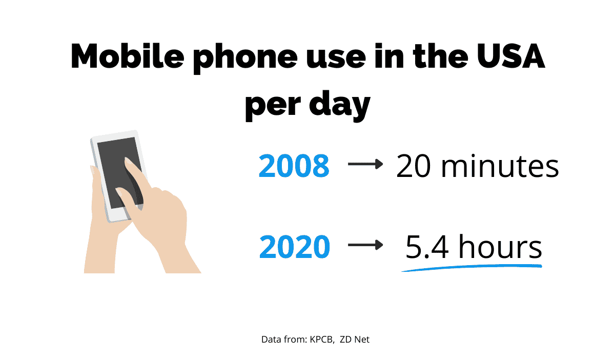
Source: Regpack
Moreover, 65% of emails are accessed on phones.
This means that the promotional email containing a link to your event that you send to prospective attendees will be opened on their phones.
If a link takes users to a landing page that isn’t adapted for mobile use, they will have trouble navigating it and finding information.
Having to zoom in and out all the time and not being able to click on items because they’re too small on the mobile screen will just make them give up, which means you lose a potential attendee.
Likewise, if the text remains small when visitors view it on a desktop, they won’t have the patience to magnify everything.
This is why it’s vital to make your event registration landing page responsive, i.e., able to adapt to the size of the screen it’s read on, like in the image below by Hubspot.
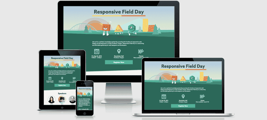
Source: HubSpot
Think of the landing page as your shop window. It’s there to give the people just browsing around a glimpse of what you have to offer and make them want to come in and buy something.
They’ll have no motivation to go in if the window is all scrambled up and they can’t see anything.
The best way to implement a responsive design to your landing page is by being proactive and planning for it from the start, or rather having a web designer do it for you.
The recommendation is to plan the flow of all elements in advance, e.g., the order the text appears in, the position of images, as well as how their combination will look on screens of various sizes.
Will the image be too big for a mobile screen? Will the text read awkwardly if it’s read on a desktop? Will the page be readable if you read it in landscape mode?
These are all legitimate questions a good web designer will consider.
One thing to keep in mind is that all elements need to be responsive.
For example, you can’t have an image that works well on a mobile screen and adapts to it, while the menu remains bulky and disproportionately large.
The entire landing page needs to work as a cohesive unit to make the user experience smooth and make them eager to buy a ticket.
Event landing page templates are a great tool that you can use to do the job for you.
They automatically make the page responsive, meaning you and your designers’ lives will be significantly easier.
You don’t have to test endlessly on multiple screens—just use a template, and you can promote your event in no time.
Provide Event Details
We may be stating the obvious here, but the landing page for your event needs to have event details displayed front and center.
You can leave no doubt whatsoever about when the event will take place, what time it starts or what the location is.
Your prospective visitors will want to know immediately if they’ll be able to attend the event they’re interested in.
It’s simple, if your landing page provides the information they need, they’ll complete the action your landing page was created for—to get people to register for your event.
According to Events.com, a good landing page should provide the answers to the following Wh- questions:
- What the event will be about so that they know if it’s relevant for them.
- When the event will take place, including time and date, and also estimated duration. If it’s a multi-day event, attendees need to know this to arrange accommodation.
- Where the event will be held, so they can arrange transportation.
These are truly the essential details that should be clearly visible and that the visitor shouldn’t have to search for at all.
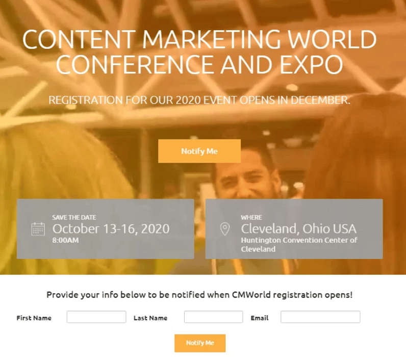
Below is an excellent example of a landing page with all the relevant information.
Source: snöball
The name of the conference states clearly what the topic will be, the date tells anyone interested when it starts and how long it will last (4 days), and the location includes not only the city and the state but also the venue.
Essentially, it gives potential attendees everything they need to know to decide whether to attend the event or not.
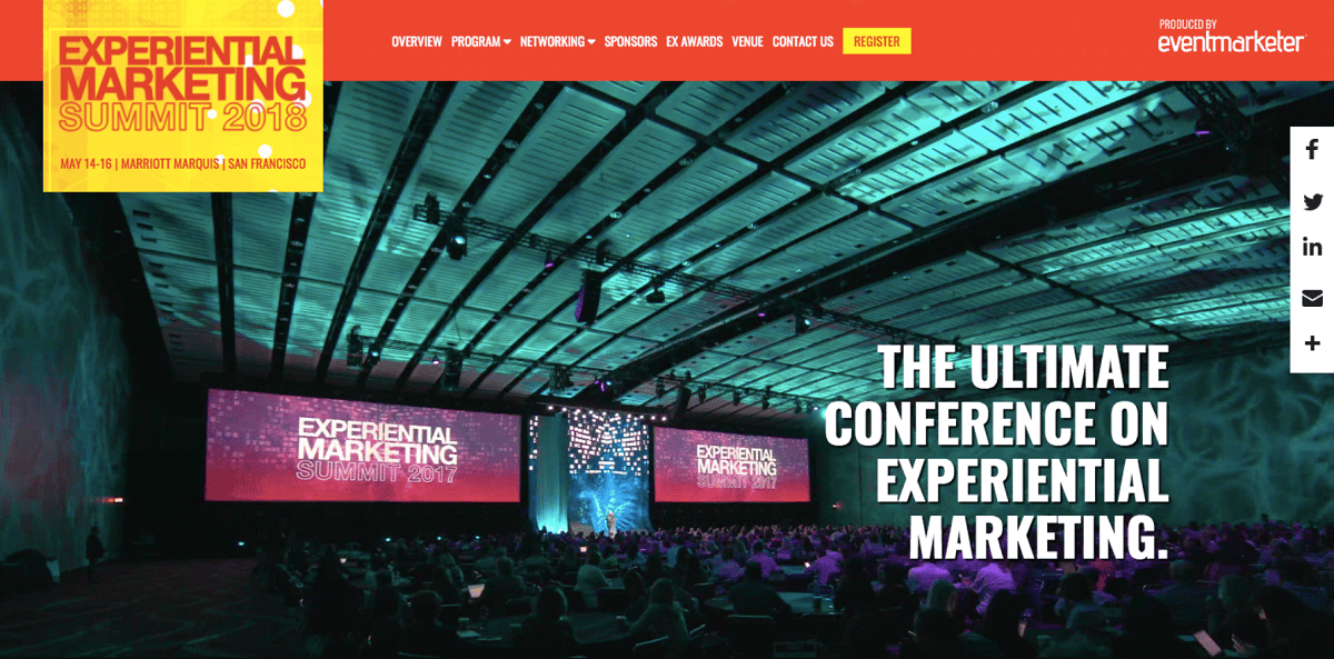
Another good practice is to display this information at the top of your landing page and pair it with a great hero image.
The hero image is the large banner pinned to the top of your page, showing website visitors what to expect at the event.
It should be impressive to really hype up the event and make visitors not want to miss it, like in the image below from Attendease.
Source: Attendease
The event details are highlighted in the top left corner, and the powerful hero image leverages the visitors’ fear of missing out to make the summit look like a party they don’t want to miss.
State the Benefits of Attending
We mentioned three Wh-questions in the previous section, but another equally important one is the why.
Why should someone attend your event? What’s in it for them?
Visitors want to know what makes your event unique enough for them to register and invest their precious time and money.
Simply stating the facts won’t cut it because it won’t make the event stand out. If it’s informative but not attractive, it’ll seem like just another out of many plain events that are organized daily.
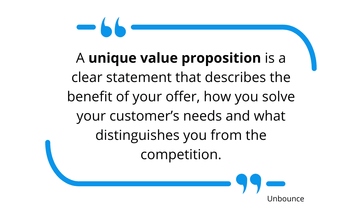
You need to communicate your unique value proposition instead. Unbounce defines it as:
Source: Regpack
Show them what makes your event unique and what they stand to gain from attending.
Language and phrasing are vital here. As Live Webinar suggests, a good idea is to phrase your copy so that the benefits are clearly visible.
For instance, writing “The topic of our conference is copywriting.” doesn’t sound appealing, but “Our conference will teach participants to craft engaging copy that’ll convert like crazy!” makes people want to buy a ticket right away.
Participants also enjoy learning from people they admire, so a benefit can also be a speaker who’s a well-known expert on the topic.
Such a speaker will pass on valuable knowledge and experience to the audience, which is a significant benefit for many attendees.
Featuring the speaker on your landing page with exciting quotes, a good image, or even a video of them inviting people to attend is a surefire way to pique the interest of prospective attendees.
Finally, the people interested in your event are probably looking for answers or solutions to particular problems.
It’s advisable to identify your target audience’s pain points and list them on your landing page, with some tips for solving them. However, you don’t want to provide ready-made solutions. Instead, offer just enough information to pique their interest but without revealing everything you know.
That way, they’ll see that you know what you’re talking about and trust that you can, in fact, offer a solution, so they’ll be eager to attend the event to find out what the answer is.
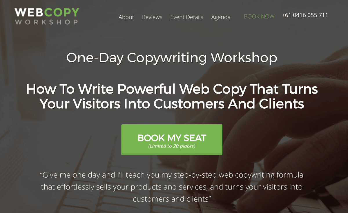
An excellent example from CopywritingCrew can be found below.
Source: CopywritingCrew
The quote at the bottom promises to offer solutions to problems that many business owners face, so chances are that many will also want to find out the best way to tackle them.
Have a Clear Call to Action
We’ve mentioned that your event landing page is there to make visitors focus on the event, and there’s one thing on it that’s even more focused: the CTA.
The CTA (call to action) is so effective that research has shown that emails with a single CTA get 371% more clicks and 1617% more sales.
The CTA allows users to complete the action your landing page is proposing. It should make visitors want to click on it to complete the registration and capitalize on this great opportunity.
To do that, it should be visible, and there should be no distractions, meaning there should be only one CTA, not several.
You want visitors to be laser-focused on the event and the event only, so this is not the time to present them with additional options.
If you do, they’ll spend too much time pondering and potentially not register.
Your landing page has a single objective, which is why you need one CTA to fulfill that single objective.
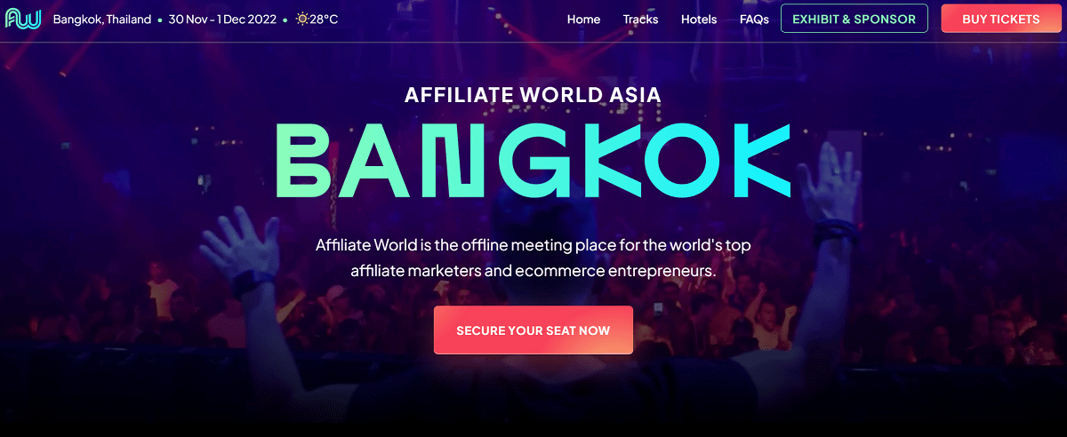
Furthermore, the CTA should stand out, so it’s a good idea to make it in a contrasting color, like in the example below for the Affiliate World Asia event.
Source: Affiliate World Asia
Their red CTA really pops against the dark background, drawing the eye straight to it and making it impossible to ignore.
There are no distractions, and the users are only tempted to do one thing: register for the event.
Moreover, it also has compelling copy. Instead of your regular Register here, the CTA says, “Secure your seat now.”
This creates a sense of urgency, making visitors feel like there won’t be any seats left, so they should grab a ticket while they can.
The text is clear and concise, very specific and persuasive, which is exactly what a good CTA copy should be.
The language itself depends on the target audience: a more serious event needs formal wording, while an event attended by millennials could even have puns or jokes.
Utilize Social Proof
Now that you’ve taken care of the technical part of your event registration landing page, it’s time to handle the social aspect.
The best way to build hype around your event is by showing how attendees of your previous events benefited from it and how it changed their lives, i.e., by showing testimonials.
Testimonials strengthen your credibility by adding first-hand experience from people who attended your event in the past.
They add a human touch to the description and really help seal the deal for your attendees to join your latest event.
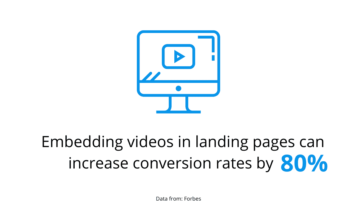
Forbes suggests that testimonials in the form of videos on landing pages lead to 80% more conversions.
Source: Regpack
Unfortunately, this doesn’t mean you can make any old video and expect it to attract attendees.
The testimonials need to be relevant and very specific, as suggested by Unbounce.
A person saying: “The conference helped my company increase sales by 20% in 3 months!” will be much more credible and effective than a mere, impersonal: “The conference was very useful.”
Similarly, a testimonial by a person prospective attendees recognize also carries more weight because they are sure that this is not a made-up identity just telling them what they want to hear.
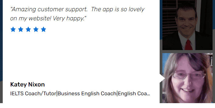
There are even apps to help your testimonials seem more credible, such as Spectoos.
Spectoos is a testimonial widget that provides socially-proofed testimonials that have a link to the LinkedIn profile of the person providing the testimonial.
Source: Spectoos
That way, attendees can check for themselves who the person is and whether they’re competent enough to comment on the subject.
Another trustworthy source of social proof are members of the target audience.
For example, if your prospective attendee is a digital marketer, they’ll appreciate input from other digital marketers, while feedback from bankers will probably be of little interest to them.
They need to be able to identify with the person whose testimonial they’re reading because they experience similar problems and, therefore, could benefit from similar solutions.
This will help reinforce the notion that the event is the right fit for them, making them more likely to register.
Conclusion
The main idea behind your event landing page is to get people to register, so it should do just that: make it easy for everyone to buy a ticket for your event.
A visually appealing page that highlights how your attendees will benefit from the event and draws their eye to the Register now button regardless of the device they’re using is the best way to do this.
It’ll make visitors curious about the event and inspire them to reserve a spot as soon as possible.
