Many clients during their project build process ask us to create one long form, or all their questions on one page.
We generally advise against this, for several reasons, which I will go into in more detail below.
Many cheap or free form tools on the market (think: Google, for example) allow you to create as many questions as you want, but with no way to have more than 1 page.
While you might think there is nothing wrong with that, it brings up some issues, especially when it comes to the experience your users will have when completing your forms and your overall completion rate.
User Experience
The goal of your registration forms is, I hope, to get applicants to complete it.
We’ve found that systems that have the “one thing per page” setup vs one long continuous form, have higher complete rates and less user error and support cases.
Just think about your own experience moving through a long one page form.
In order to make changes, or review what you’ve entered, there is a lot of scrolling involved. It’s hard to find specific questions you might want to review since it isn’t organized in a logical sectional way.
All of these frustration points lead to less completion.
One Section Per “Page”
Having one “thing” per page of your registration process doesn’t mean one question on every page. It does mean creating logical sections of your registration process and splitting it up that way.
And when I say logical, I mean to your applicants, not to you.
When users are completing forms, they don’t want to think. They want the process to move them through seamlessly so they just see a question, answer it and move on without questioning why it’s being asked.
It might sound weird when you think about what I just said, but after building over 10,000+ Regpack systems, our data tells us that higher conversion rates come with systems that follow this approach.
The basic idea is taking a complex process (your entire registration) and breaking it up into smaller and easier pieces. Each “page” is then one piece.
Why is splitting your process up logically a good thing?
If higher conversion rates aren’t enough of a sell, here are a few more reasons…
- It’s easier for your applicants. Easy = happy applicants = happy you.
- Easier to solve form errors.
- Communicating progress is easier.
- Conditional logic is easier to implement for a more custom user experience.
- It’s better for mobile.
Do you notice a theme here. Easier. Logically splitting up your forms is easier.
It’s easier for your applicants.
As I mentioned above, breaking up the process into small chunks reduces their mental load and will make completing your forms easier, which will up your conversion rate.
It’s easier to solve errors.
If a user gets a dreaded “red” warning that they haven’t completed a field, finding and fixing the error is easier when there are less questions on the page.
In one long form, they will have to scroll up and down to find the error or errors, which can be frustrating.
The key to successful registration: don’t frustrate your users!
It’s easier to communicate progress to applicants.
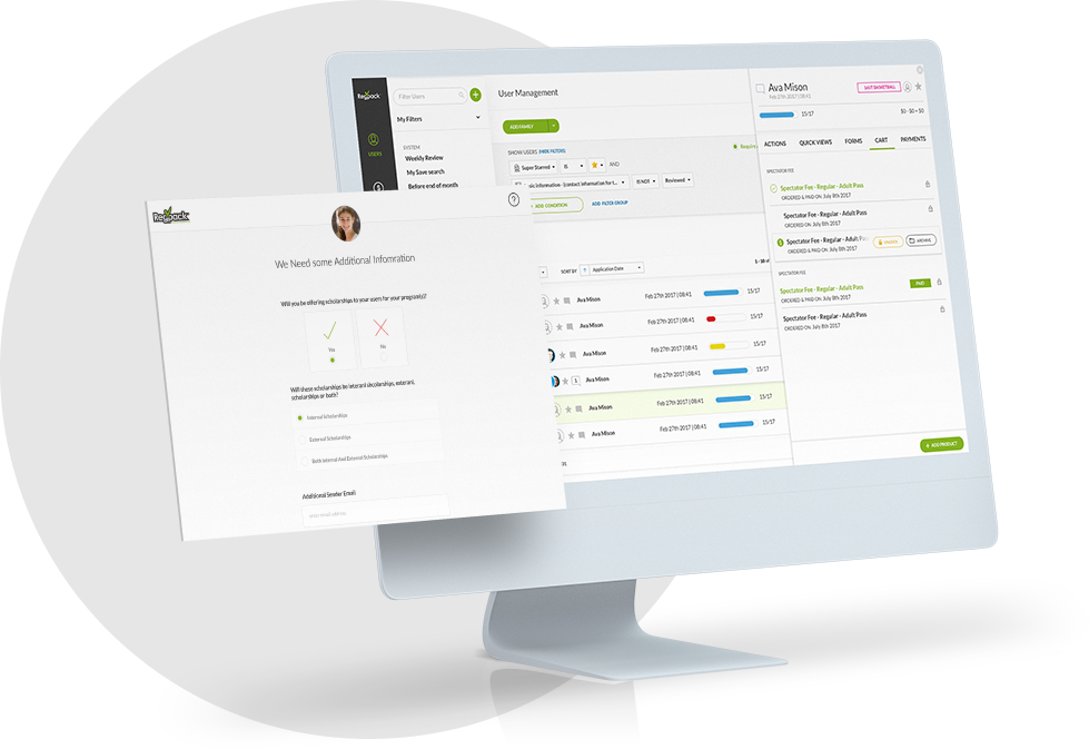
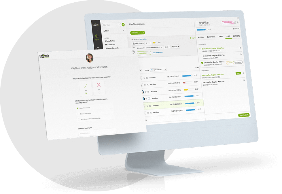
One of the benefits of a registration software are the “dashboard” tools that show an applicant, and you, the progress they are making through the application.
When logically breaking up the process, it is much easier to communicate to applicants where they are in the application process, send triggered emails to complete a specific section, and see the status of your entire applicant group.
It’s easier to customize your registration flow and conditional logic.
If you have conditional logic going on in your process, you want to split things up to make sending each applicant on their own unique registration path easier.
If you want to show certain forms or ask certain questions to applicants based on the answer to a question – having one long form just won’t work.
It’s easier for registering on mobile devices.
One good thing that has come from increased mobile use is thinking about simplicity when it comes to design, functionality and flow.
If you translate one long form onto a mobile device, the issues described above, especially scrolling up and down, are magnified. However if you have one page for a small subset of questions, it is a lot easier to manage, fill out and edit on a small screen.
Conclusion
If it isn’t obvious, at Regpack, we strongly advise against using one single form to ask and gather the information you need.
Our Project Managers are experts at building systems to help your registration flow logically and make sense for your applicants.
Our goal is to get your users through your process quickly and easily, so you can spend your time on other things!


